


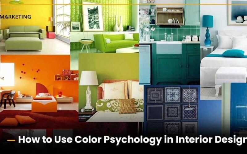
Colours have a significant impact on how we feel, think, and act. When it comes to home design, using colour goes beyond just looking good; it taps into the psychology of how we experience and engage with our spaces. The colours we choose for our walls, furniture, and decor can subtly yet powerfully influence our moods, energy, and overall well-being. Grasping this psychological connection is essential for crafting homes that not only look stunning but also feel balanced and nurturing.
Red
Red is a colour of passion, energy, and excitement, making it a powerful player in interior design. Its invigorating qualities can infuse a space with dynamism and warmth. In-home design, red is frequently used as an accent to bring life to a room. Imagine a striking red feature wall in a living room, energizing the social space, or vibrant crimson throw pillows adding a dramatic flair to a neutral sofa. However, because of its boldness, too much red can become overwhelming or even stressful. So, finding the right balance and using red thoughtfully is crucial to enjoying its benefits without feeling uneasy.
Blue
Blue represents the vastness of the sky and the soothing waves of the sea. It is a fantastic choice for spaces like bedrooms and bathrooms, where relaxation and rejuvenation are key. Soft, muted blues can create a serene and peaceful vibe, while deeper shades can introduce a touch of sophistication and depth. However, it’s worth noting that blue can sometimes feel a bit cold or melancholic, especially in rooms that don’t get much natural light. To counterbalance this coolness, adding warm accents and textures can help create a more inviting atmosphere. If you’re unsure about how to use blue effectively, companies like Domenech Design LTD can help you navigate the complex relationship between colour and emotion, guiding you in choosing palettes that truly resonate with your personal style.
Green
Green embodies nature, symbolizes growth, health, and harmony. It brings a sense of balance and tranquillity into our homes, connecting us to the great outdoors. Green is incredibly versatile, fitting seamlessly into various spaces, from living rooms and bedrooms to kitchens. Its calming effect can create a soothing environment, while its natural associations promote feelings of well-being. Green can evoke different moods, from the refreshing vibrancy of lime green to the grounding richness of forest green.
Yellow
Yellow, the colour of sunshine, exudes optimism, joy, and intelligence. It’s a shade that can lift our spirits and spark happiness and creativity. In-home design, yellow shines in areas that could use a little extra light and positivity, like kitchens and kids’ rooms. A bright yellow kitchen can feel warm and welcoming, while yellow accents in a study can enhance focus and clarity. But just like red, yellow’s brightness needs to be handled with care. Too much vivid yellow can be overpowering, and some shades might even lead to feelings of frustration. Softer or pastel yellows often provide a more calming and gentle option.
Gray
Gray is often seen as a neutral backdrop, but it carries a versatility that can elevate home design. Depending on its undertones and pairings, grey can feel cool and contemporary or warm and inviting. It provides a calming and unobtrusive foundation, allowing other colours and textures to shine. This makes grey a popular choice for living rooms and bedrooms, offering an air of elegance and modernity. The secret to using grey successfully lies in layering different shades and incorporating various textures to keep the space from feeling flat or monotonous.
White
White is often seen as a symbol of purity, cleanliness, and spaciousness, making it a classic and adaptable choice in interior design. It has a wonderful ability to reflect light, which helps rooms feel brighter and more open. Plus, white acts as a fantastic canvas for displaying artwork and other decorative pieces. While it can create a serene and simple atmosphere, an all-white room might sometimes come off as a bit sterile or impersonal. To bring warmth and personality into a white-dominated space, consider adding textures, warm wood tones, and vibrant pops of colour.
Brown
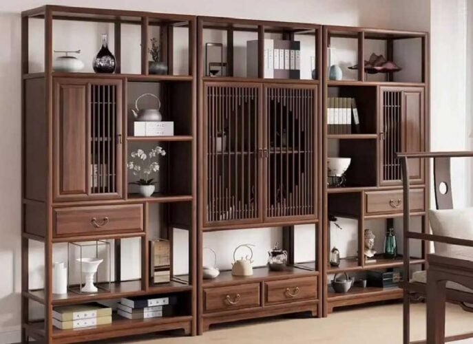
Brown, reminiscent of earth and wood, brings to mind feelings of warmth, comfort, and stability. It creates a grounding effect and helps connect indoor spaces to nature. With a spectrum of shades from light beige to deep chocolate, brown can evoke a range of moods, from cosy and rustic to sophisticated and elegant.
Conclusion
The magic of colour in home design is all about crafting a space that feels uniquely yours and enhances your well-being. Take the time to think about how different colours affect your mood and how they work together in a room, and you can create an environment that’s not just beautiful to look at but also uplifting for your spirit.